

There is more to a PowerPoint presentation than to make slides and presenting them. The entire process can be divided into a series of steps each of which is extremely important in order to make an effective presentation which could leave a lasting impression on the audience. The steps are summarized as-
- Getting started- The groundwork
- Making the PowerPoint
- Making it better –Getting rid of the rough edges
- Practise ( makes you perfect)
- Prelude to the presentation- Acclimatising
- Presentation – Last but not least
Getting started:
Knowledge, it is said is power. Having a better understanding of the various aspects of a presentation helps us make it better.
- Knowing the topic- This step forms the foundation of any presentation. No presentation is complete without proper knowledge of the topic. While preparing, the presenter must make an effort to read from many sources in order to have a better understanding of the topic. Latest articles regarding the topic can be looked upon ww.pubmed.gov which is a free to access database with user-friendly features maintained by the national library of medicine with nearly 23 million citations. When making a presentation on controversial issues, it is always ideal to know the consensus opinion. Understanding a topic also makes us feel more confident about our ability to present.
- Knowing the audience- A presenter makes a better impression if he presents in a manner that appeals to the audience. A presentation for postgraduates would be different from a presentation for a group of super-specialists. In the former, the presenter ought to lay emphasis on basics and talk about the consensus opinion, while in the latter the presentation could deal with more controversial issues. Moreover, postgraduates would be more interested in topics that are likely to become in exams. Similarly, presenting to a captive audience like a classroom would be different from presenting to a floating audience whose interest is more fleeting.
- Knowing the venue- Understanding the venue makes us prepare better. Some venues are ideal for presentations while others can be makeshift ones. The lighting and acoustics of the venue are important aspects and can make or break a presentation. Making a presentation in a dark room would ensure better visibility of the contents of the screen while the converse holds true for a presentation in a well-lit room. The background colour of slides and the colour of the words must be suitably modified to obtain the optimal results. Similarly, making a presentation in a room with little or no background noise and echo gives the best results and the presenter will need to modify their voice levels appropriately based on the acoustics of the presentation hall. Understanding details of audiovisual aids like the kind of mike (collar, handheld, fixed, etc), pointer and mode of changing slides (remote-controlled / laptop-based) also help us in preparing for the presentation better.
- Reason for presentation- Presenting a competitive paper with a fixed time period (usually 6-8 minutes) would be different from presenting a guest lecture where the time period is a little more liberal.
Make the points crisp and clear
Remember attending a seminar is not a replacement for thoroughly reading a paper. Your primary aim is to present the topic in a visually appealing way so that the main points are obvious
Making the presentation:
Slide background-An appropriate slide background is essential for good visibility. Colors can be divided into two general categories: Cool (such as blue and green) and Warm (such as orange and yellow). Cool colors work best for backgrounds as they appear to recede away from us into the background. Warm colors generally work best for objects in the foreground (such as text) because they appear to be coming at us. It is no surprise, then, that the most ubiquitous PowerPoint slide color scheme includes a blue background with yellow text.

Figure 1: The picture depicts 3 different slides. The first slide (left) having red letters in the blue background is difficult to read. Yellow letters on a blue background (center) is easy to read and is most suitable for a dark room. Using black letters on white background (right) is most useful when presenting in a well-lit room.
A dark background (dark blue, grey, etc.) with white or light text works well for a presentation in a dark room (such as a large hall). Likewise, if most of the room lights are on (which is highly advisable) then a white background with black or dark text works much better. (Figure 1) In rooms with a good deal of ambient light, a screen image with a dark background and light text tends to washout, but the dark text on a light background will maintain its visual intensity a bit better.
Ultimately, the aim is to ensure a slide that is easily visible without causing any strain to the eyes.
- Font The font size must be big enough for people to read from the back of the room. This can be achieved by ensuring that the letters are visible 2 meters away from the computer screen. Avoid using capital letters for all the words in a heading as it is difficult to read. It is advisable to use the same font set throughout the presentation. Use sans serif font for titles (e.g., Arial, Verdana, Helvetica, Myriad Pro, etc.) and a serif font for bullets or body text (e.g., Times New Roman, Garamond, Goudy, Palatino, etc.). Most books are typeset this way because it makes them more readable. Regardless of the font chosen, make sure that the text can be read from the back of the room.
- Don’t use italics except for the scientific name of virus, bacteria, etc. foreign words and phrases, such as in vivo and et al, The names of publications, such as The Lancet, Journal of Epidemiology.
- Use bold sparingly – do not put whole blocks of text or bullet lists into bold, instead use it for emphasis.
- Also, desist using underlined fonts to highlight a section of the texts; you can use the color difference for the same.
- Many times fonts seem to change when presenters move from one computer to another. In reality, the fonts are not changing—the presentation computer just doesn’t have the same font files installed. So if you are using some unique fonts, then when you save your PowerPoint file (only on a PC), you should click Save Options in the "Save As…" dialog window. Then, select the Embed TrueType font’s checkbox and press OK. Now, your presentation will keep the font file and your fonts will not change when you move computers (This doesn’t apply for presentation on a Mac).
Anatomy of a slide: A slide comprises of three parts, a heading, the body of text and the reference. (Figure 2)
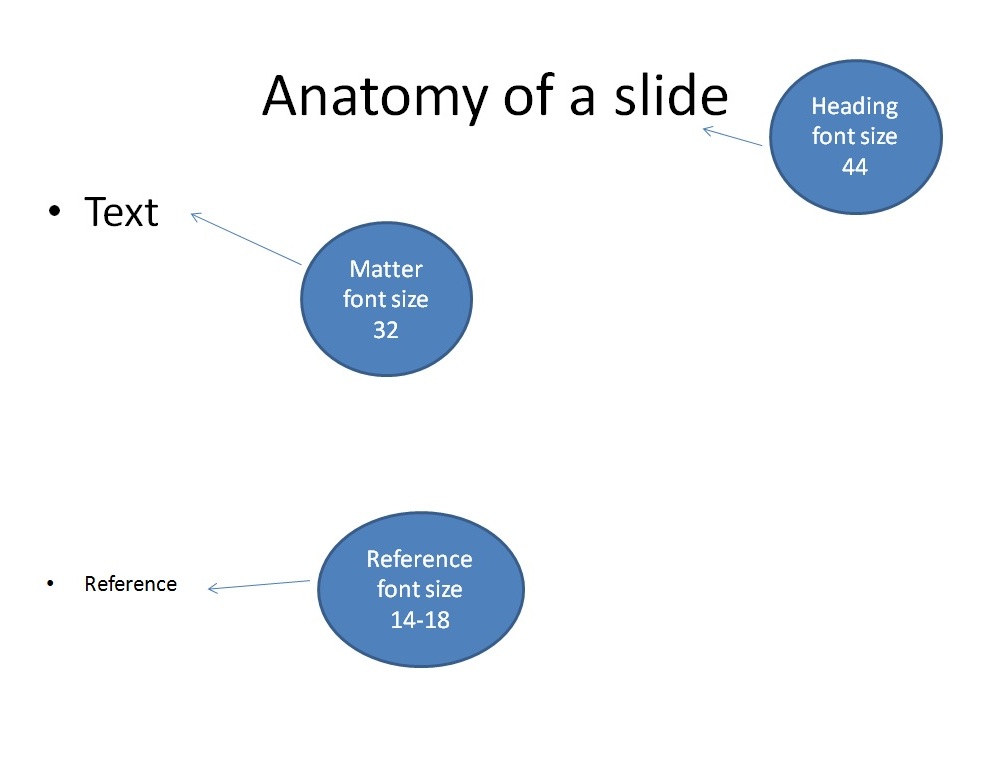
Figure 2: The anatomy of a slide comprises of three parts- The heading with a font size of 44 usually, the text or body with the font size of 32 and reference at the bottom with a font size of 14-18
Heading- Every slide needs to have a heading as the audience ought to know what the presenter is speaking about. Otherwise, there is a risk of losing interest. Do not use headings like next or continue as the audience might lose attention. It is always ideal to use catchy phrases to keep the audience involved. (Figure 3).

Figure 3: Using a catchy heading (red arrow) helps to keep the audience engaged
Text or body- The matter comprising the body of the slide must contain a few elements which can be summarized by the acronym SLIDE
Simplify – The matter must be easy to read and quick to grasp
Lose the clichés- The content of the slide must be grammatically correct. However, the presenter must not use this as an opportunity to demonstrate their flair of the English language. The simple text is best appreciated.
Information needs emphasis- Bullets and change in color of font can be used to draw emphasis so that audience can quickly concentrate on the most important elements of the slide (Figure 4)

Figure 4: Using different color to stress upon the most important aspects of the slide helps the audience to read the slide quickly. For example in this case, one can infer that grid photocoagulation is not advisable for cases of CRVO with macular edema.
Designate elements – When needed, graphs and figures or videos can be used to add detail where words may not suffice (Figure 5)

Figure 5: The figure shows three slides that seek to convey the same information but with different effects. The slide to the left has no heading and is written in a paragraph with very little recall value for the audience. The slide to the center has a heading with the information being organized in the form of points and hence conveys the information better. The slide to the right is depicted in the form of a graph conveying the information that blurred vision is the most common symptom followed by red-eye and pain and hence is easy to grasp. The presenter must make every attempt to make the slides as simple as possible.
Empathy for the audience – Last but not least, the whole exercise must be done keeping the audience’s interest in mind.
While making a slide, the presenter must try to convey his/her impression gathered from various sources rather than simply copying from them. This ensures a better understanding of the subject, lesser words on the slide and enhanced confidence during the presentation. Expand initials of an abbreviation in your slide when you are using it for the first time. In subsequent slides, the abbreviation can be used. Don’t use the commercial drug name like Nevanac eye drop. It is advisable to use “topical Nepafenac Ophthalmic Suspension”. The concentration of the drug must also be mentioned (0.1% in this case)
5/5/5 rule- There must be no more than five words per line of text, five lines of text per slide and five text-heavy slides in a row.
Using bullets/numbers-Numbers should be used for lists with a sequence. For example steps of GRAM staining. If there is no sequence, priority or hierarchy then bullets are the best choice. Full stops are not needed phrases or single sentences
Video in a Powerpoint- Ensure that all the videos pertaining to the presentation are placed in the same folder as the presentation before embedding them in the PowerPoint. It is ideal to use the WMV or AVI format videos as they are compatible with a PowerPoint presentation. When transferring to a storage device like a pen drive or a compact disc, ensure that the entire folder is copied.
Reference- Quoting references is extremely important as they form the basis of our statements. References must be written after the text or body of the slide and can have a font size of 14-18. They must be written in a standard format. The format varies depending upon whether we are quoting a journal, book or a website. The standard form of quoting references can be looked up at http://www.icmje.org or http://www.nlm.nih.gov/bsd/uniform_requirements.html
Once the slides are made, always make it a point to summarize the key points of the presentation. This helps the audience to have a second look at your presentation and hence make their impression about the topic as well as the presenter.
Making it better – Getting rid of the rough edges:
Once the presentation is made, the presenter has to have a relook at it a number of times to ensure that there are no spelling mistakes. Spelling mistakes end up showing the presenter in a very poor light and can be easily avoided by going through the slides in a meticulous manner. Moreover, watch out for common mistakes that look inconsequential but can spell your doom. Care must be taken while using words like “since” and “for” in the presentation. “Since” is used for a point in time like “Since 1999” or “Since Sunday” while “For” Is used for a period of time like “For 7 days” or “For 1 year”. Similarly, terms like “Circum corneal congestion “and “ciliary congestion” are acceptable but the term “Circum ciliary congestion” which is an unscientific mixture of the two terms is wrong!
The best way to overcome these mistakes would be to go through the presentation number of times. Showing the presentation to our colleagues and peers is also a good way of improving the PowerPoint. It is likely that they might identify an error which we would ignore. It also lets us know whether our slides are properly conveying the message when read by others and thus acts as a dry run for our presentation.
Practice
The key to a good presentation is good practice. We need to know the timing of the presentation and then practice accordingly. It is ideal to write down what one would like to speak for every slide and then rehearse the script. This ensures that we present every slide in a crisp and precise manner thereby keeping ourselves within the time limit. We need to rehearse multiple times till the words come out of us naturally, rather than appearing to be read out from a script. Moreover, the presenter must know the presentation inside out which can happen only after repeated rehearsals.
A timer can be used to time during rehearsal. Is our voice sounding too drab and boring? Is a particular slide taking too much time? Is the meaning of the slide being conveyed properly? Does a sentence need rephrasing? To know all this and much more, it is ideal to record our voice during rehearsal. This can be done using the features on a smartphone. It is advisable not to use the tools available on the PowerPoint for the same, as the properties of time and voice may be stored permanently resulting in the slides getting changed automatically while making the actual presentation.
Prelude to the presentation- Acclimatizing:
On the day of the presentation, dress smartly. The dress must be clean, well ironed and appropriate for the venue. Wearing a suit or a blazer in the summer season in a non-air conditioned room is definitely asking for trouble. The presenter must be comfortable in whatever he/she wears. If the dress is inappropriate it will result in the presenter being self-conscious, thereby losing his/her focus on the presentation. Arrive at the venue on time. Load the presentation and check if the presentation works properly (especially the videos). Once these issues are taken care of, seat yourselves at an appropriate location and relax.
Presentation – Last but not least:
Finally, when the time arrives, walk confidently towards the mike. Face the audience and start speaking slowly and clearly. Keep reminding yourselves that the words have to come out incoherent manner for the audience to follow you. Do ensure that your mouth faces the mike. This can be an issue in case of handheld mikes where the presenter sometimes turns his/her head towards the screen and away from the mike. While presenting we need to speak to the audience and not appear to be reading out the words in the slides. Not everything written in the slide must be read out exactly. For example, if the slide reads that, “one-fifth of the patients with flashes/floaters will have a retinal tear”. We could present it as “Retinal tear is noted in 20% of the symptomatic patients”. This ensures that the audience concentrates on you rather than the slide. Go through the slides in a steady manner giving enough time for the audience to understand but not long enough for them to get bored! To keep the audience interested, use the help of anecdotes picked up from various sources or from your own experience. A pointer needs to be used to emphasize a particular point and not to distract the audience by rolling it all over the slide nonspecifically.
And last but not the least, you have to let your voice must reflect your enthusiasm and during the period of presentation, you need to be the star of the show
Tips for Effective PowerPoint Presentations
• Text
- Maximum five lines of text per slide
- No more than 20-25 words per slide
- Mix upper and lower case letters
- Slides should not contain complete sentences
- Use short bullets that emphasize or reinforce what you are discussing
- 10 Second Rule – If it takes longer than 10 seconds to read the slide there is too much content
• Font
- Use easier to read sans serif fonts such as: Arial, Tahoma, Verdana
- Avoid serif fonts such as: Courier, Times New Roman, and Garamond
- Use 44 font size for headings
- Use 38 font size for bulleted points
- Minimum of at least 28 size font
- Remember person in back of audience must be able to read text
• Color
- Avoid using black and white for the color of all slides
- Avoid background colors like red, yellow, and white
- Use dark background colors like blues and greens
- Always use bright colors for lettering such as white, yellow, and bright orange
- When designing charts make sure to use a contrast of colors
- Recommended that you use between 3-6 colors per slide
- Use color to help separate concepts.
- Highlight important information
- Presentations may look different when using an LCD projector.
- You may want to test slides ahead of time
• Content
- Picture should match what you are discussing o Use clip arts for appropriate age level participants
- Try and keep charts free from clutter and make it simple o Avoid using too much audio, can be distracting o Remember the presentation is about the content, not about pictures, movies, and audio files