
One of the important components of your thesis is analyzing your data.This can range from a few percentages as in a small descriptive study to a more detailed analysis. While collecting data for your thesis it is important to give some thought to what the important parameters that you would want to study are. Make sure that you collect adequate information about these parameters and that you enter the information in a way that it can be analyzed.Doing basic analysis using MS Excel and a few online resources is not difficult for anyone who is a little familiar with using a computer. You do not have to be an expert to do this. This chapter aims to guide you through the steps of identifying the type of data you are working with, guiding you through different common statistical techniques on MS Excel and introducing you to a few online resources. With these basic skills, you will be able to do most of your data analysis on your own.Now that you have finished entering your data completely or you want to do an interim analysis you need to start thinking about data analysis.
I am making a few assumptions:
1. Your data has been entered in MS Excel or a similar spreadsheet.
2. Each cell contains a single number or word. For example (Cell A 2: contains the number 2: if it contains 2,4 then we are in trouble). If you are using text ensure that you have entered the same text consistently ( For non-proliferative diabetic retinopathy you have entered NPDR wherever required and not NPDR, non PDR, NPDR or non-proliferative diabetic retinopathy in different cells )
Avoid doing this
|
Associated systemic conditions |
|
1,2,4,8 |
1- Diabetes mellitus,2, hypertension, 4- Asthma, 8 – angina gluteus maximus
Do this instead:
|
Diabetes mellitus |
Hypertension |
Asthma |
Angina gluteus maximus |
|
1 |
1 |
1 |
1 |
- Yes, 2 No
3. (Note Excel names cells based on column (A, B, c..) and row ( 1, 2….) headings. Cell A2 lies at the junction of column A and row 2.
4. You have given the column names (It's always better to give meaningful names that will describe what that column represents. For e,g: if you are counting Drusen use Drusen or No. of drusen as the header and not Dr. You may waste time figuring out what dr stands for if (hopefully not) the dreaded DNB letter asking for thesis revision comes and you need to reanalyze your data. It is useful if you are using abbreviations to have a data dictionary that lists what each abbreviation is and also what categories you have coded in each column ( e.g Male =1, Female =2)
5. Use a single row for column names. Do not use two rows – this confuses excel and makes it difficult to export into different statistical software. E.g: If you are describing the presence of diabetic retinopathy (DR) Avoid doing this
|
Diabetic retinopathy |
|
|
Right eye |
Left eye |
|
Present |
Absent |
Use either of these formats:
|
DR Right eye |
DR Left eye |
|
Present |
Absent |
|
Diabetic retinopathy |
|
Right eye |
( right eye, left eye, both or none)
6. Blank cells are either left blank or entered with a fixed value ( use a text value such as NR or NA if you are entering numbers)
7. Dates are entered as dates in a consistent manner ( if you are planning to use them for analysis.
8. Visual acuity is appropriately coded ( Use 1,2, 3.. ) instead of (6/6, 6/9, 6/12). Convert to Log MAR if possible
Before you start your data analysis:
1. Do you have a backup? Ensure that your excel sheet is backed up in more than one computer (preferably email it to yourself too).
2. Start your analysis in a copy of your final excel document. In case you accidentally delete or think you have mixed up data you will have the original to compare with.
3. Identify the types of data that you have: You will need to apply different statistical tools for different types of data:
Categorical data:
a. Nominal: These have no specific order or hierarchy e.g: Iris color, gender, religion. You would typically represent this data as a count, proportion or percentage.
typically represent this data as a count, proportion or percentage.
b. Ordinal: There is an order or hierarchy here: Grades of diabetic retinopathy ( no retinopathy, Mild, Moderate, etc) or Pain scores ( No, Mild, and so on)
Quantitative data:
Discrete: These are items that can be counted with an equal distance between values> e,g: number of lattices, number of iris nodules> You cannot have 1.2 lattice or 1.4 iris nodules, number of glaucoma medications, age groups. There could be a limited number( e.g: number of extraocular muscles or a practically unlimited number: Number of red blood cells in the body)
Continuous variables: As the name indicates these are measurements that cannot be counted and can be described using intervals in the range of values. e.g: IOP ( theoretically it could be 16.34765 though we may use values of 16 to describe this), axial length, etc.
Clean your data: This is an important part of the analysis and should be performed before you go ahead with any analysis;
- Look at your spreadsheet: are there any obvious errors in alignment. Typically all entries formatted as numbers are aligned on the right side of the column, all text entries are on the left. This should be consistent for a column – if all your entries are numbers then everything should be right-aligned. If a few are aligned to the left check their format before proceeding.
- For each column of discrete or continuous values: Check minimum and maximum values). Are there any surprises ( e.g: IOP entered as 150, instead of 15 – correct it now instead of later)
- For nominal or ordinal values – if you have used number codes: Check minimum and maximum values ( do they fall in the range of codes that you have used). If you have used text – is all the text entered in a similar fashion.
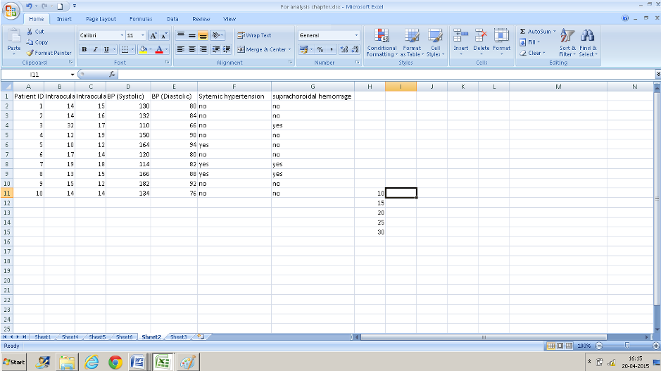
Research question: Incidence(number of new cases) of and risk factors for suprachoroidal hemorrhage following peribulbar injection for cataract surgery.
Sample dataset :
|
Patient ID |
Intraocular Pressure ( Right) |
Intraocular Pressure ( Right) |
BP (Systolic) |
BP (Diastolic) |
Systemic Hypertension |
Suprachoroidal Hemorrhage |
|
1 |
14 |
15 |
130 |
80 |
no |
no |
|
2 |
14 |
16 |
132 |
84 |
no |
no |
|
3 |
32 |
17 |
110 |
66 |
no |
yes |
|
4 |
12 |
19 |
150 |
90 |
no |
no |
|
5 |
10 |
12 |
164 |
94 |
yes |
no |
|
6 |
17 |
14 |
120 |
80 |
no |
no |
|
7 |
19 |
18 |
114 |
82 |
yes |
yes |
|
8 |
13 |
15 |
166 |
88 |
yes |
yes |
|
9 |
15 |
12 |
182 |
92 |
no |
no |
|
10 |
14 |
14 |
134 |
76 |
no |
no |
Doing basic calculations using MS Excel :
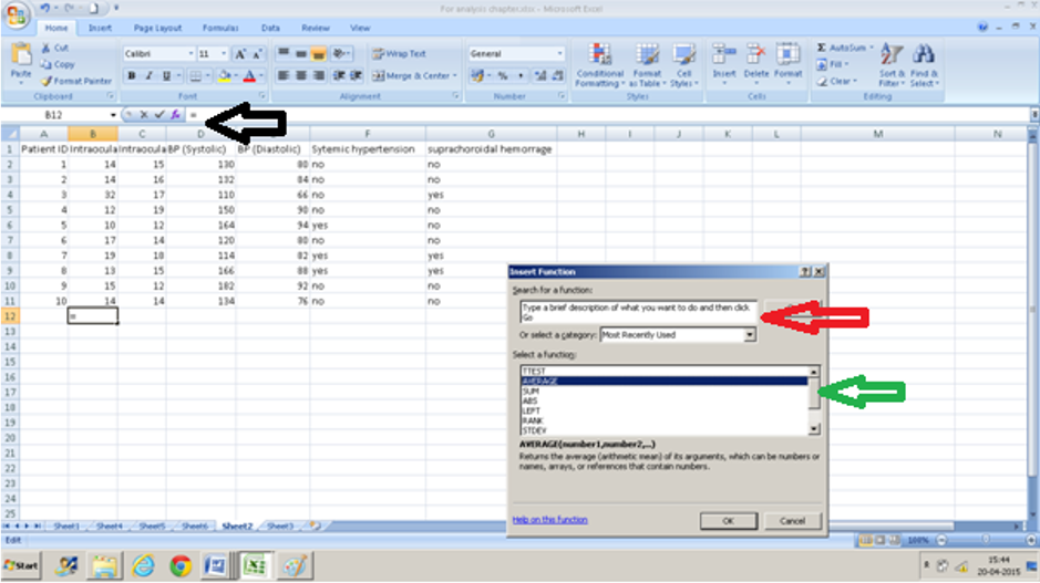
Calculating mean (Average) on MS Excel.
- Click on a cell into which you want the value to appear( in this example B12).
- Press the fx ( black arrow)
- Either type in Average in the text box ( red arrow) or scroll down to ‘AVERAGE” from the drop-down menu ( green arrow) after selecting “All” from the “or select a category” drop-down menu
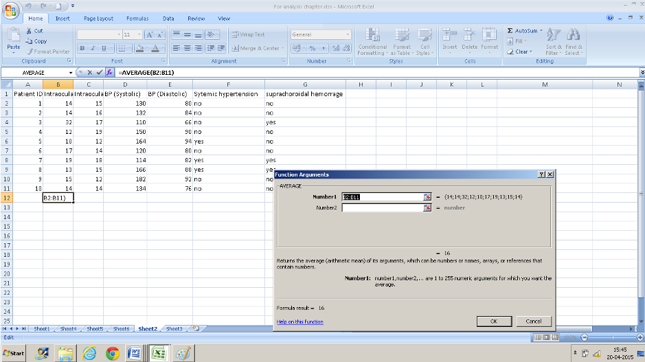
- Enter the range of values in the text box that appears for “number 1”. In this case, we want the average for values from cell B2 to cell B11 so we enter B2: B11. You can also click the selection button at the right extreme of this text box and select this range of cells instead.
- Press Ok and you have the average values.
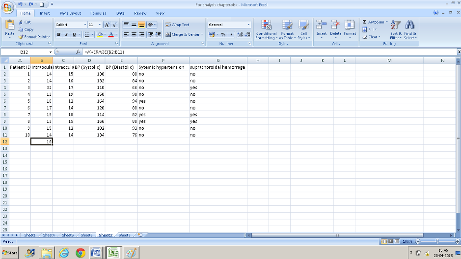
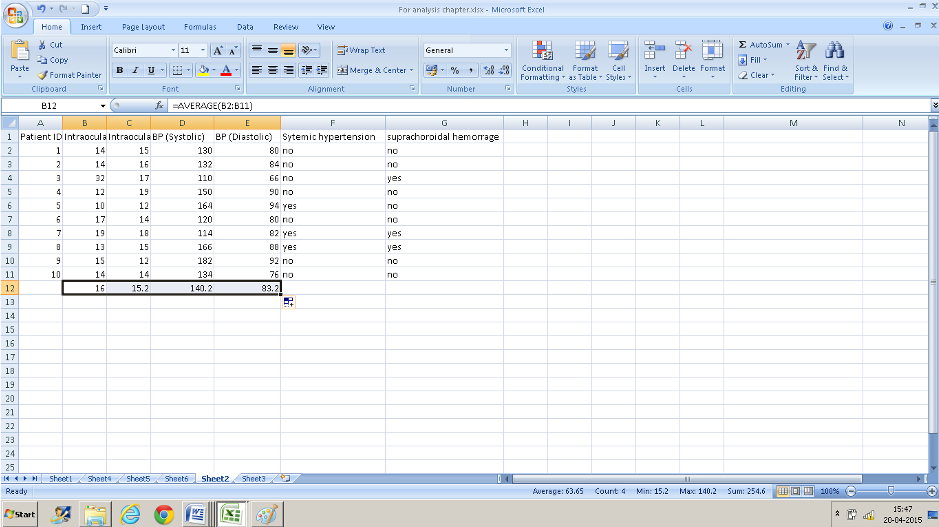
Right-click on the cell where the formula was applied ( here B12) and drag it across- the formula gets copied to adjacent cells
Calculating Standard Deviation:
- Click on a cell into which you want the value to appear
- Press the fx ( black arrow)
- Either type in Average in the text box ( red arrow) or scroll down to ‘STDDEV” from the drop-down menu ( green arrow) after selecting “All” from the “or select a category” drop-down menu
- Enter the range of values in the text box that appears for “number 1”. In this case we want the standard deviation for values from cell B2 to cell B11 so we enter B2: B11. You can also click the selection button at the right extreme of this text box and select this range of cells instead.
- Press Ok and you have the standard deviation values.
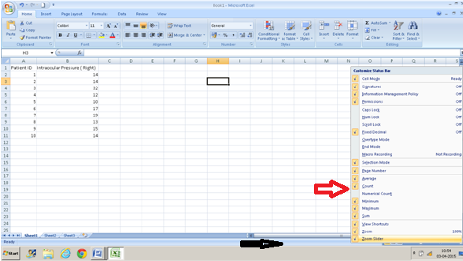
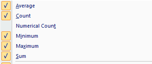
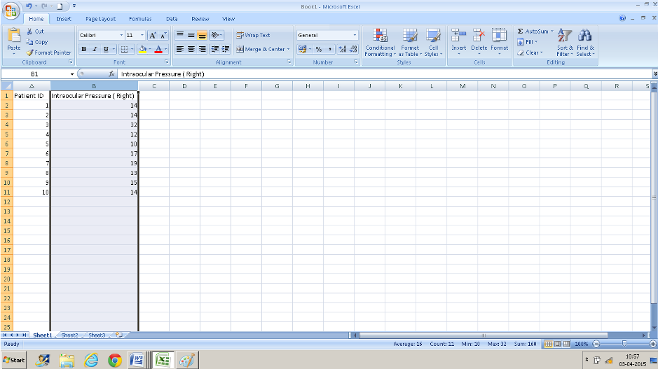
You can also get these values displayed in the status bar(black arrow) that runs at the bottom of the excel window by right-clicking on the status bar and clicking those parameters that you want to be displayed(red arrow and the text box below). Once you do this you can see these values when you click on the title of the column ( A, B, etc).
We often need to present the number of patients with clinical measurements falling into specific ranges/ intervals. One way is to count the figures in your excel column in each subgroup and put down the numbers. The second way would be to use the ‘SORT” function and count. ( Avoid using the SORT function on your database – one missed cell can completely mix up your data – if you have to use it, use it in a copy of your database). You can use the COUNTIF function if you are interested in only a few specific values. T
Using the “COUNT IF” function
Use this function to count the number of times a particular value occurs in a range of values ( a column or row )Here we want to check how many right eyes had an intraocular pressure of 14 ( data entered in column B)
- Click in a cell that you want the result to display in.
- Navigate to “COUNTIF” in the insert function box
- Enter the range of values. B2: B11 in the first text box and 14 in the second box and you have your result of 3 displayed
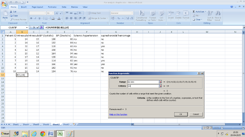
The “COUNTIF” function I use if there are only a few variables to count.
To look at a range of values or multiple variables it is easier to use the “FREQUENCY” function. This is slightly different from other formulae that we have entered so far. We will try and divide the IOP values (column B)of the right eye into different groups.
Using the “FREQUENCY” function
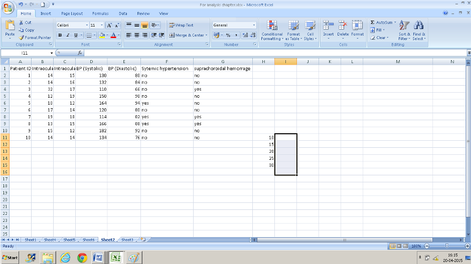
- You need some additional information: the different cut off groups that you want to classify your data into. Here for example , if we want to classify our right eye IOP into different groups we will need to have an idea of the range of measurements ( using the minimum and maximum numbers we know that it is between 10 and 32). You can use any groups you want to . I have used 10, 15, 20, 25, 30 s my cutoffs. Enter those numbers in ascending order in a column( I have entered these from H11: H15) – ensure that the column/cells adjacent are also empty.
- Now select the adjoining cells in the column to the right- select one more row than you did in column H(I11: I16).
- Now navigate to FREQUENCY from the formula bar. The data array is B2: B11 and the BINS array is H11:H15 which contains the IOP values that we decided on.
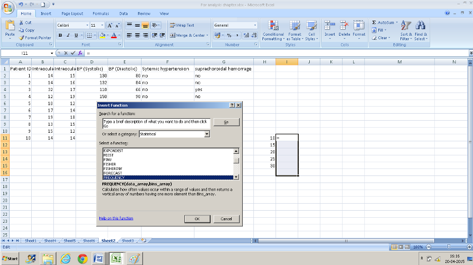
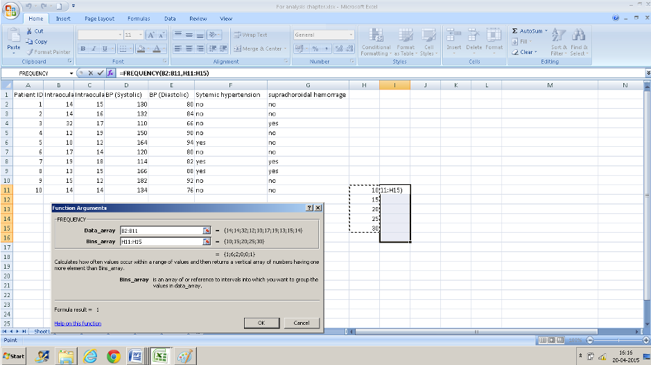
- Instead of pressing Ok Press CTRL+SHIFT+ENTER simultaneously. (if you do not do this you will have only the top value displayed).
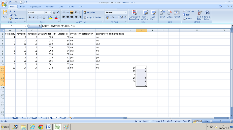
- The number of cases falling in each range is displayed in the cell adjacent to the entered numbers. The cell I16 displays the numbers that were out of the range that we entered ( the one IOP of 32 in this case)
- If you are not very familiar with MS Excel it may help to copy the values into your worksheet and try and run the same analysis with these numbers to check if you are doing it correctly.
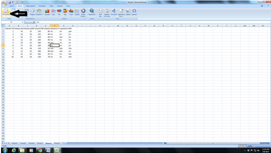
Using the pivot table function:
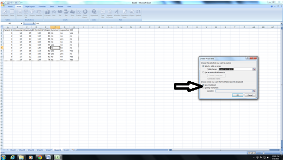
- Click anywhere in the entered data then Go to the insert tab on the toolbar and select pivot table.
- The Pivot Table Field list will open on the right side of the worksheet. It will open in a new worksheet or the same worksheet depending on what you have selected in the Pivot table box.
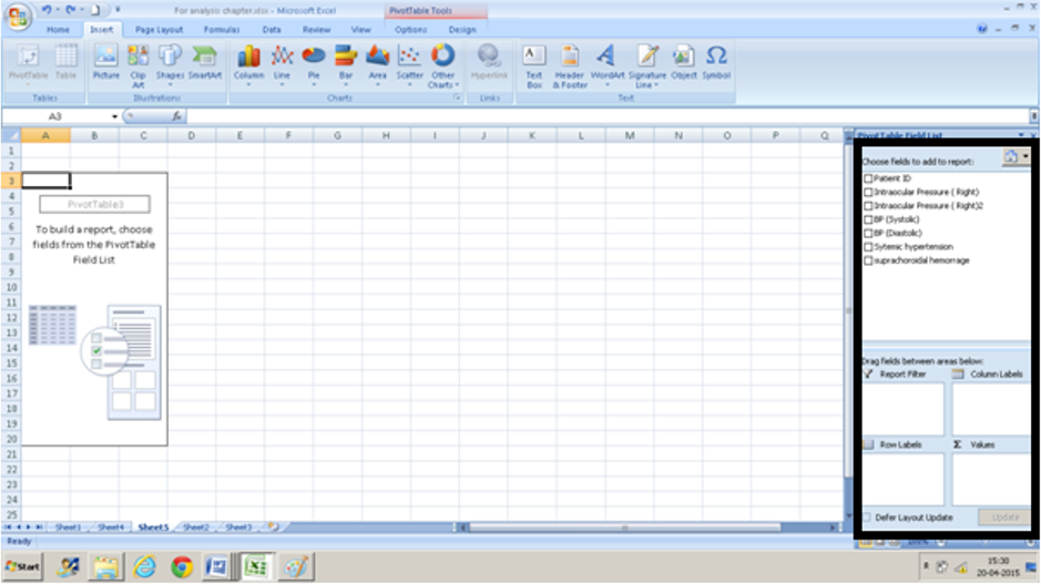
- Choose fields ( column headings) and drag them from the task pane into the boxes on the lower right-hand corner. We are interested in seeing how systemic hypertension and suprachoroidal hemorrhage are associated. We drag suprachoroidal hemorrhage into the row box and systemic hypertension into the column box.
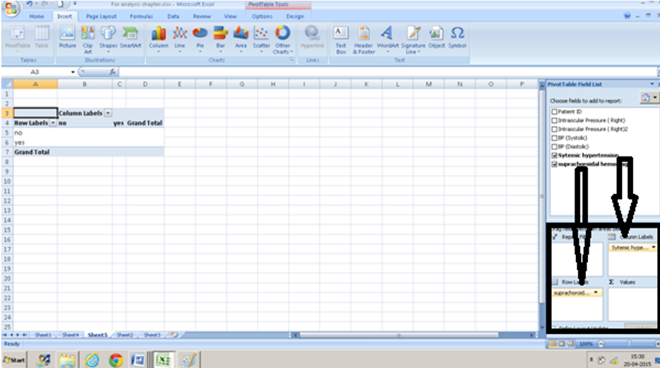
- Since we are interested in how many persons with systemic hypertension had a suprachoroidal hemorrhage we drag suprachoroidal hemorrhage into the ∑ box ( at the bottom right )too.
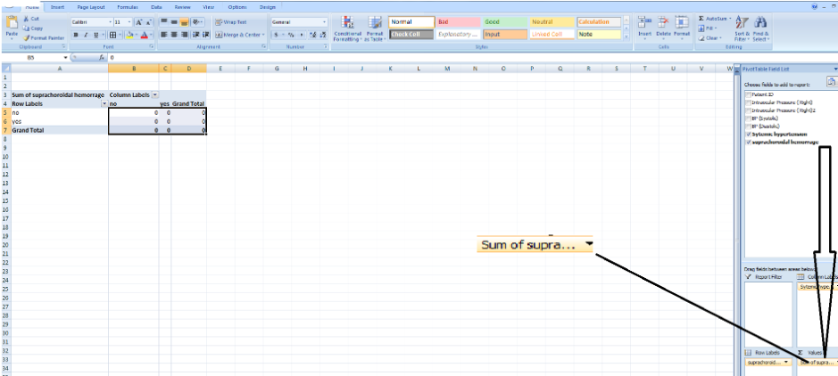
-
By default, the value provided is the sum of the values which we are not looking for in this case. So we select count instead and we have a 2x2 table that shows us the distribution of those with systemic hypertension and suprachoroidal hemorrhage.
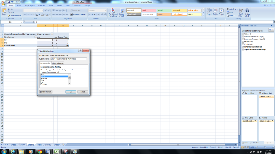
-
If you are keen on looking at the average instead of some value you can select that instead.
Now that you are familiar with a little bit of analysis let us go back to the research question
E.g: For the research question that we started with, I have listed the type of data and the basic descriptive statistics that would be required for all the parameters that we collected data for. (Appendix 1)
Incidence(number of new cases) of and risk factors for suprachoroidal hemorrhage following peribulbar injection for cataract surgery.
Data collected:
Appendix 1: Types of data and appropriate descriptive statistic
|
Parameter |
Units/categories |
Type of data |
Descriptive |
|
Age |
years |
Continuous |
Mean/Std Dev |
|
Age group |
10 year age groups |
Ordinal |
Percentage/Proportions |
|
Gender |
M:F |
Nominal |
Percentage/Proportions |
|
Eye |
OD:OS |
Nominal |
Percentage/Proportions |
|
Systemic Hypertension |
Yes/No |
Nominal |
Percentage/Proportions |
|
Diabetes |
Yes/No |
Nominal |
Percentage/Proportions |
|
Systolic blood pressure pre-op |
mm Hg |
Continuous |
Mean/Std Dev |
|
Diastolic blood pressure pre-op |
mmHg |
Continuous |
Mean/Std Dev |
|
Random blood sugar |
Mg/dl |
Continuous |
Mean/Std Dev |
|
Systolic blood pressure post block |
mm Hg |
Continuous |
Mean/Std Dev |
|
Diastolic blood pressure post block |
mmHg |
Continuous |
Mean/Std Dev |
|
Refractive error |
Dioptres |
Continuous |
Mean/Std Dev |
|
Intraocular pressure |
mm Hg |
Continuous |
Mean/Std Dev |
|
Axial length |
mm |
Continuous |
Mean/Std Dev |
|
Keratometry k1 |
Mm/D |
Continuous |
Mean/Std Dev |
|
Keratometry k2 |
Mm/D |
Continuous |
Mean/Std Dev |
|
Type of surgery |
Phaco/SICS/ECCE |
Nominal |
|
|
Duration of surgery |
minutes |
Continuous |
Mean/Std Dev |
|
Intraoperative vitreous loss |
Yes/No |
Nominal |
Percentage/Proportions |
|
Pre-op Glaucoma |
Yes/No |
Nominal |
Percentage/Proportions |
|
Pre-op retinal disease |
Yes/No |
Nominal |
Percentage/Proportions |
|
H/o previous eye surgery |
Yes/No |
Nominal |
Percentage/Proportions |
|
Suprachoroidal hemorrhage |
Yes/No |
Nominal |
Percentage |
Note: For discrete values, it is better to use counts and proportions to describe the values. Sometimes if there are multiple values possible. e.g Glaucoma medications pre and post glaucoma surgery are described as means).
We would now be interested in :
Incidence of suprachoroidal hemorrhage: Number of cases who developed suprachoroidal hemorrhage/number of cases undergoing cataract surgery in that time period), In this case, 3/10 or 30%
To assess the risk factors for suprachoroidal hemorrhage we would now want to compare the two groups ( the group that had the hemorrhage versus the group that did not have ). It would be helpful to create a table with descriptive statistics for both the groups. (Appendix 2)
Appendix 2: List of possible risk factors that for eyes with suprachoroidal hemorrhage could be studied with the type of data
|
Parameter |
Suprachoroidal hemorrhage (number of cases) |
No suprachoroidal hemorrhage ( number of cases) |
Descriptive |
|
Age |
Mean(Std Dev) |
Mean(Std Dev) |
Continuous |
|
Systolic blood pressure pre-op |
Mean(Std Dev) |
Mean(Std Dev) |
Continuous |
|
Diastolic blood pressure pre-op |
Mean(Std Dev) |
Mean(Std Dev) |
Continuous |
|
Random blood sugar |
Mean(Std Dev) |
Mean(Std Dev) |
Continuous |
|
Systolic blood pressure post block |
Mean(Std Dev) |
Mean(Std Dev) |
Continuous |
|
Diastolic blood pressure post block |
Mean(Std Dev) |
Mean(Std Dev) |
Continuous |
|
Refractive error |
Mean(Std Dev) |
Mean(Std Dev) |
Continuous |
|
Intraocular pressure |
Mean(Std Dev) |
Mean(Std Dev) |
Continuous |
|
Axial length |
Mean(Std Dev) |
Mean(Std Dev) |
Continuous |
|
Keratometry k1 |
Mean(Std Dev) |
Mean(Std Dev) |
Continuous |
|
Keratometry k2 |
Mean(Std Dev) |
Mean(Std Dev) |
Continuous |
|
Duration of surgery |
Mean(Std Dev) |
Mean(Std Dev) |
Continuous |
|
Gender |
Percentage |
Percentage |
Nominal |
|
Eye |
Percentage |
Percentage |
Nominal |
|
Systemic Hypertension |
Percentage |
Percentage |
Nominal |
|
Diabetes |
Percentage |
Percentage |
Nominal |
|
Type of surgery |
Percentage |
Percentage |
Nominal |
|
Pre-op Glaucoma |
Percentage |
Percentage |
Nominal |
|
Pre-op retinal disease |
Percentage |
Percentage |
Nominal |
|
H/o previous eye surgery |
Percentage |
Percentage |
Nominal |
|
Age group |
Percentage |
Percentage |
Ordinal |
Based on the type of variable we would need to identify the type of test to be applied to assess whether any of these are statistically significant risk factors. (Appendix 3)
Appendix 3: Risk factors with appropriate test suggested
|
Parameter |
Suprachoroidal hemorrhage (number of cases) |
No suprachoroidal hemorrhage ( number of cases) |
Descriptive |
Test |
P-value |
|
Age |
Mean(Std Dev) |
Mean(Std Dev) |
Continuous |
t-test |
|
|
Systolic blood pressure pre-op |
Mean(Std Dev) |
Mean(Std Dev) |
Continuous |
t-test |
|
|
Diastolic blood pressure pre-op |
Mean(Std Dev) |
Mean(Std Dev) |
Continuous |
t-test |
|
|
Random blood sugar |
Mean(Std Dev) |
Mean(Std Dev) |
Continuous |
t-test |
|
|
Systolic blood pressure post block |
Mean(Std Dev) |
Mean(Std Dev) |
Continuous |
t-test |
|
|
Diastolic blood pressure post block |
Mean(Std Dev) |
Mean(Std Dev) |
Continuous |
t-test |
|
|
Refractive error |
Mean(Std Dev) |
Mean(Std Dev) |
Continuous |
t-test |
|
|
Intraocular pressure |
Mean(Std Dev) |
Mean(Std Dev) |
Continuous |
t-test |
|
|
Axial length |
Mean(Std Dev) |
Mean(Std Dev) |
Continuous |
t-test |
|
|
Keratometry k1 |
Mean(Std Dev) |
Mean(Std Dev) |
Continuous |
t-test |
|
|
Keratometry k2 |
Mean(Std Dev) |
Mean(Std Dev) |
Continuous |
t-test |
|
|
Duration of surgery |
Mean(Std Dev) |
Mean(Std Dev) |
Continuous |
t-test |
|
|
Gender |
Percentage |
Percentage |
Nominal |
Chi-square/Fishers |
|
|
Eye |
Percentage |
Percentage |
Nominal |
Chi-square/Fishers |
|
|
Systemic Hypertension |
Percentage |
Percentage |
Nominal |
Chi-square/Fishers |
|
|
Diabetes |
Percentage |
Percentage |
Nominal |
Chi-square/Fishers |
|
|
Type of surgery |
Percentage |
Percentage |
Nominal |
Chi-square/Fishers |
|
|
Pre-op Glaucoma |
Percentage |
Percentage |
Nominal |
Chi-square/Fishers |
|
|
Pre-op retinal disease |
Percentage |
Percentage |
Nominal |
Chi-square/Fishers |
|
|
H/o previous eye surgery |
Percentage |
Percentage |
Nominal |
Chi-square/Fishers |
|
|
Age group |
Percentage |
Percentage |
Ordinal |
Chi-square/Fishers |
Now that you have identified the parameters that you want to compare between the groups we can proceed to the specific tests:
A. In general, to compare continuous data from two groups with that is from at least 30 cases in each we can use the t-test ( this is a very broad rule and assumes that the data area normally distributed). It is possible to do this test using MS Excel using your raw data or using various programs available online ( you will need to calculate mean, standard deviation and the number of cases for each variable in each group that you want to compare). This example uses only 10 cases and the t-test is not appropriate in this situation.
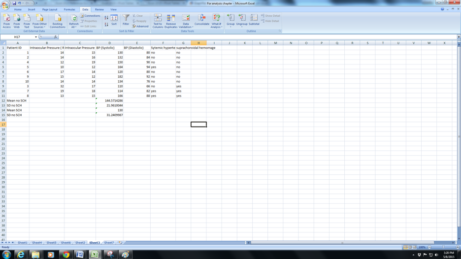
1. Assume you want to compare the pre-op systolic blood pressure in the group that had a suprachoroidal hemorrhage (SCH) versus those who did not(Normal). You can either arrange the data continuously in the same column as in the example or is separate columns for the SCH group and the normal group. after the SCH group but ensure that you know which group is which .
2. Click in a blank cell either below or in another blank column – this is where the result will show up.
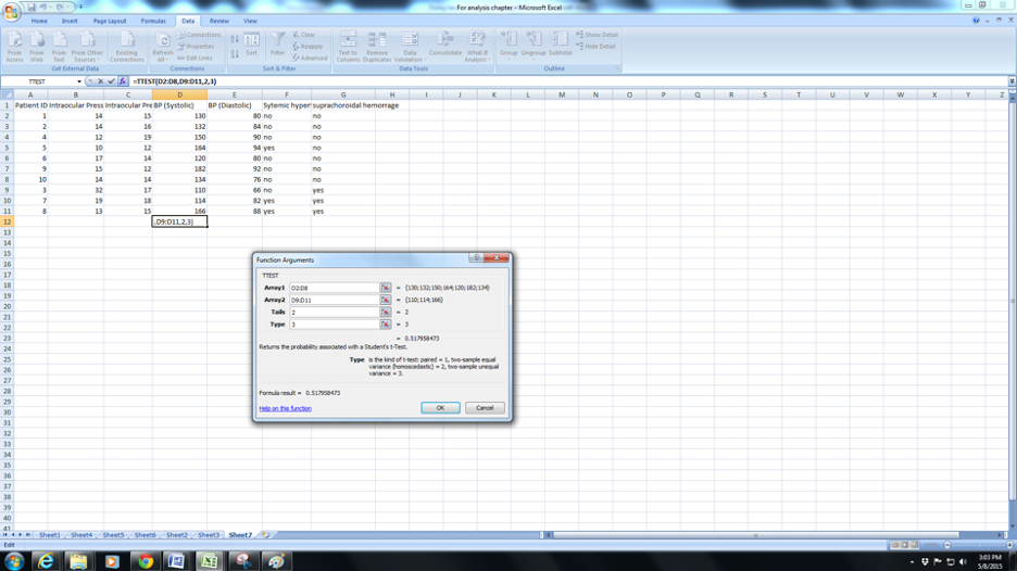
a. Click the fx( function button) and navigate to TTEST .
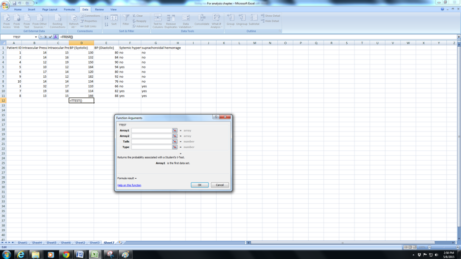
b. You will be prompted to select Array 1. Array 1 is the set of values for normals(C2:C8). Note (from column G) that I have arranged the data so that all the normals are continuous and the SCH also arranged serially.
c. Now click on Array 2 and enter the range of values for “SCH”(C9:C11).
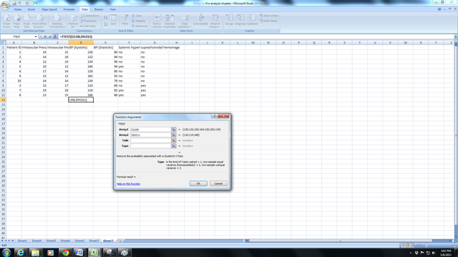
d. Now click in Tails : here the you will need to enter the number “1” (for the one-tailed test ) or “2” ( for a two-tailed test). In general if in doubt enter 2. In most situations we would prefer a two-tailed test ( this means that you feel the mean BP in Normals could be greater or lesser than the mean BP in SCH). In some situations such as , for example, mean hair length before and after a hair cut you would expect only one possibility – shorter hair and you could enter 1 for a one-tailed test in such a case.
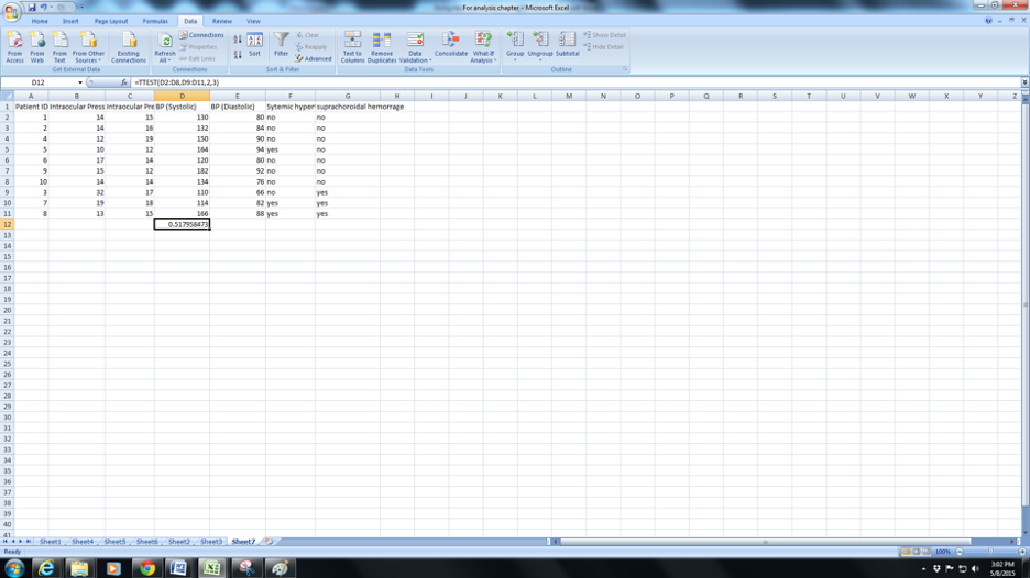
e. Now you will need to complete the next row for Type. Enter 1 for paired ( typically before and after measurements for the same eye/person. IOP before and after surgery for example), Enter 2 for two-sample equal variance or 3 for Two-sample unequal variance . Variance is essentially a measure of how different the spread of data is within a group). Since this chapter is meant to simplify things enter 3 if in doubt. Press Ok and you have the p-value for the t-test (0.51 in this case).
2. To compare proportions you would need to use the Chi-square test. While it is possible to do this on MS Excel it is a bit complicated and easier to do using some online tools. However to use these tools you will need to reduce the data to a 2 x 2 table. This is easy to do and I will illustrate with an example below:
“1500 patients underwent cataract surgery, of these 500 were hypertensive . 100 had a suprachoroidal hemorrhage (SCH). Among those who had a suprachoroidal hemorrhage 50 were hypertensive.” If we are interested in assessing whether systemic hypertension was a risk factor for SCH we will need to arrange the data into a 2 x 2 table ( 2 rows , 2 tables). The standard format for such tables is :
Rows: cases (or group1)first row, controls(or group2) second row, risk factors(or outcome 1) first column, no risk factor (or outcome 2)second column.
|
Suprachoroidal hemorrhage present |
Suprachoroidal hemorrhage absent |
|
|
Systemic hypertension present |
50 |
450 |
|
Systemic hypertension absent |
50 |
950 |
You can also use the Pivot table function described earlier in MS Excel to create 2 x 2 tables
Using online resources for data analysis.
There are multiple free online calculators available that can help with analysis. For those who are looking for something simple I would recommend the Graph pad online calculators (http://www.graphpad.com/quickcalcs/ ).
These calculators are available for a variety of different situations but I will stick to describing their use for continuous data ( t-test) or categorical data( Chi-square or Fishers test).
For both calculations you will need to provide summary data ( Mean, Standard deviation and number of observations for continuous data) and a 2x2 table for categorical data. Since you can calculate these easily from excel this is not difficult.
You will notice columns that let you type or paste in data however there are two caveats here. For the t-test you can type or paste in one value at a time and not the entire column, so you will need to feed in values individually, and you cannot save the typed data – you are better off using summary data that you can easily get from your Excel spreadsheet. For the categorical data – you can paste entire columns – however, remember that what is required is “observed” and “expected” values which have to be calculated from your data. It is easier to use the 2x2 table that you can create either manually or using the pivot table function in Excel described earlier.
Chi-square test/Fishers test at http://www.graphpad.com/quickcalcs/
Step 1: Select the data that you want to analyze – let us start with categorical data(Fisher's, Chi-square, McNemar's, Sign test, CI of proportion, NNT (number needed to treat), kappa)
Step 2: Select the option that we want - Fisher's and chi-square. Analyze a 2x2 contingency table. We are not using(Chi-square. Compare observed and expected frequencies) because of the need for expected and observed values discussed above.
Step 3: Enter appropriate values in the 2 x 2 table
Step 4: Select the appropriate test. You can select Fishers or chi-square. Fishers are more accurate and can be used for smaller numbers so you can select that as default.
Step 5: Select one or two-tailed. Again two-tailed is recommended unless you are very sure that you expect a difference in only one direction. If you are not sure select two-tailed.
Step 6: Press calculate and record your p values from the output. Using the same set of values in the example above you will get an output like this:
|
SCH present |
No SCH |
Total |
|
|
Hypertension present |
50 |
450 |
500 |
|
Hypertension absent |
50 |
950 |
1000 |
|
Total |
100 |
1400 |
1500 |
Fisher's exact test
The two-tailed P value equals 0.0004
The association between rows (groups) and columns (outcomes) is considered to be extremely statistically significant.
Going through the process for continuous data :
Step 1: Select the data that you want to analyze – let us start with continuous data- two sets of values that you want to compare (Descriptive statistics, detect outlier, t-test, CI of mean/difference/ratio/SD, multiple comparisons tests, linear regression)
Step 2: Select the option that we want - t-testto compare two means.
Step 3: Choose a data entry format. ( For reasons that we discussed earlier select “ Enter mean, SD and N “
Step 4: Enter appropriate values in the spaces ( the mean, Standard deviation (SD) and number of observations (N) that you have obtained from the Excel sheet),
Step 5: Select the appropriate test. Select unpaired t-test. For the paired test you will need to use Excel (see t-test section above ) and press calculate.
Step 6: Select one or two-tailed. Again two-tailed is recommended unless you are very sure that you expect a difference in only one direction. If you are not sure select two-tailed.
Step 6: Press calculate and record your p values from the output. This the output we obtained
P-value and statistical significance:
The two-tailed P value equals 0.4841
By conventional criteria, this difference is considered to be not statistically significant.
Confidence interval:
The mean of Group One minus Group Two equals 12.00
95% confidence interval of this difference: From -25.20 to 49.20
Intermediate values used in calculations:
t = 0.7297
df = 9
standard error of difference = 16.444
Review your data:
|
Group |
Group One |
Group Two |
|
Mean |
142.00 |
130.00 |
|
SD |
22.00 |
31.00 |
|
SEM |
7.78 |
17.90 |
|
N |
8 |
3 |
Using CORRELATION in MS Excel:
We often use correlation to look for an association between two variables and I will briefly describe how you could do this using MS Excel.
Correlation tells you if two variables change together. Essentially whether there is an association between the two. Pearsons Coefficient of correlation varies from -1 to +1, Minus 1 indicates a perfect negative correlation and +1 indicates perfect positive correlation i.e for every unit increase in one variable the second variable increases by one unit for positive correlation and decreases by 1 unit for the perfect negative correlation. A correlation of 0 indicates no association.
The advantage of correlation is that we can compare two parameters with different units such an as height and weight. It is important to understand that good correlation does not imply causation. For example, if you notice a positive correlation between ice cream sales and drowning deaths it does not mean that there is any causative effect. Both ice cream sales and the number of people swimming increase in summer and therefore they are associated.
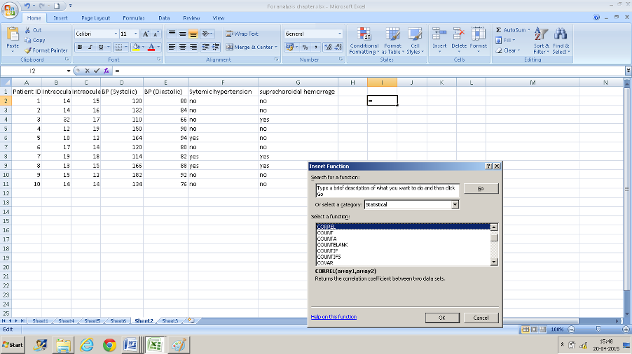
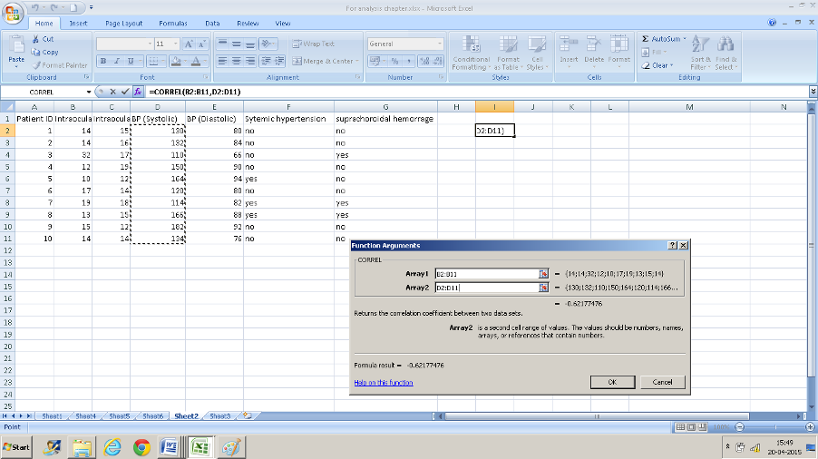
Example: We want to assess the correlation between intraocular pressure in the right eye (column B) and systolic blood pressure (column D).
- Click in a cell that you want the result to display in.
- Navigate to “CORREL” in the insert function box
- Enter the range of values. B2: B11 in the first text box and D2: D11 in the second box and you have your result of 0.62 displayed.
The tests described in this chapter will help you with most of your data analysis. If you get in trouble do not forget the Help function in Excel – it will guide you through most difficulties. This chapter is by no means a complete description of all the tests that you may need to use but it’s a start.